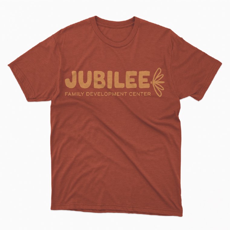
A rebrand for a cause.
This project was created to bring new life to the branding of a local nonprofit. My team and I were assigned Jubilee Family Development Center, an organization that advocates for the stability of families and the education, mentoring, and care of at-risk children. We took aspects of their old color palette and completely reworked the logo to better match their mission, as the “dragonfly” symbol represents joy and new beginnings. We also designed a full social media package to reach a wider audience to give more families in need access to these services.
This was created in collaboration with my wonderful teammates Chloe Lyden and Tiana Miller.


